Screenful — Actionable insights from your tasks' management data
Screenful is an all-in-one productivity analytics app featuring automatic tracking, visualization, and project data sharing.
For a long time, project analytics were both hard to understand and time-consuming. You would have to export data from productivity tools into spreadsheets to get any actionable insights from your task management data.
Screenful is an analytics tool that automates all your manual work. Save time and get any metrics you need at a glance with dashboards, custom charts, and scheduled reports.
Analytics and reports in Screenful
Analytics and reports is an easy-to-use business intelligence solution that makes it easy to build charts and reports from your task data and share them with your colleagues.
Track all of your projects, see correlations and analyze trends

Fully integrated with monday.com

Track multiple metrics at once with the dual axis line chart or the multi-bar chart

Easily share reports via email or Slack
Build custom dashboards and reports from monday.com data
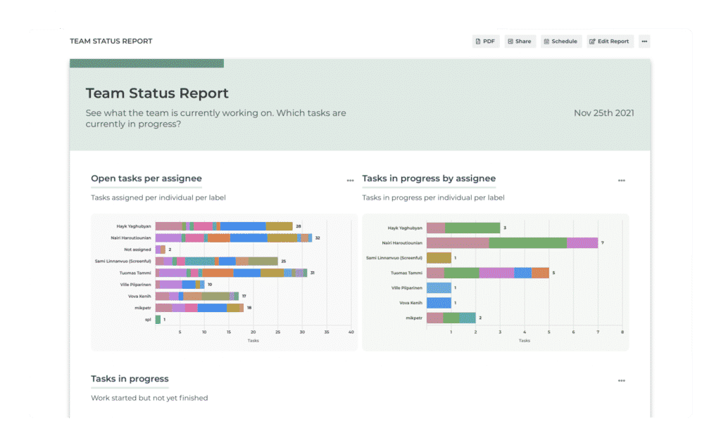
- See what others are working on and what has recently been resolved.
- What tasks are currently in progress?
- Who’s working on what?
- What has been recently completed?
- Which tasks are blocked, high priority, or overdue?

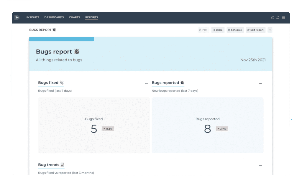
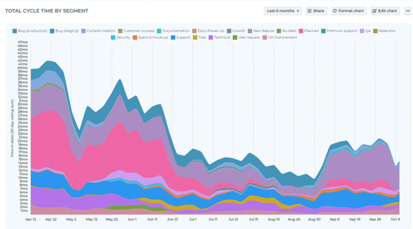
Track lead and cycle time
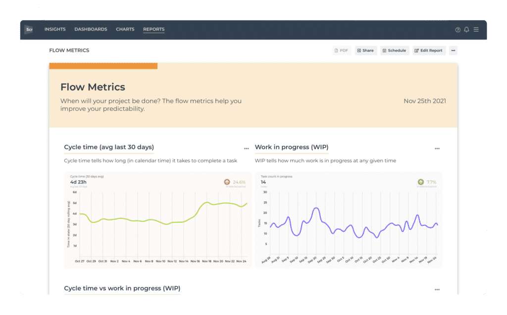
- What is the average lead time for resolving bugs, tickets, or stories?
- Which tasks were slow, and which were fast to resolve?
- How much time do tasks spend in each workflow state?
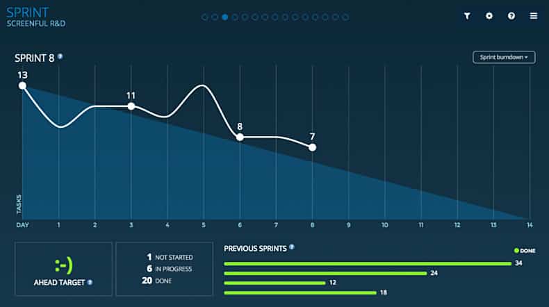
Track sprint progress with a burndown chart
Track the progress of your sprints with a burndown chart. See how much is left and whether you’re in time or behind. See the sprint status per each team member. Are you meeting your sprint goal?
- How is your sprint burning?
- Are we ahead or behind the target in our current sprint?
- How many tasks have not been started, in progress, or done?
- What is the current sprint status for each team member?
- Track velocity across multiple sprints.
- See the amount of work planned vs done.
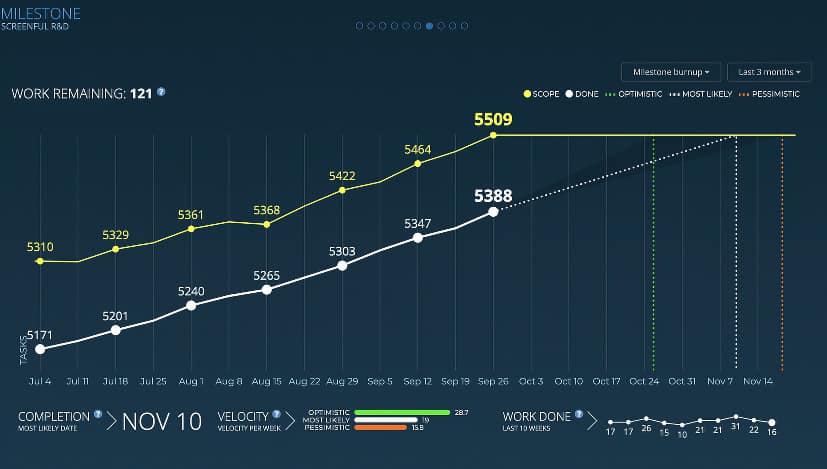
Get data-driven forecasts of the delivery dates
- How much work is done vs still to-do for the next project/milestone?
- How much work have you completed each week?
- What is the most likely delivery date based on historical velocity?
Aggregate Reports — Track metrics across multiple projects
Sometimes it can be hard to stay on track with your work if your tasks are scattered over multiple boards. This can happen if you’re working on multiple projects at once, or if your projects are split into multiple separate boards. Aggregate Reports can track metrics across multiple projects.
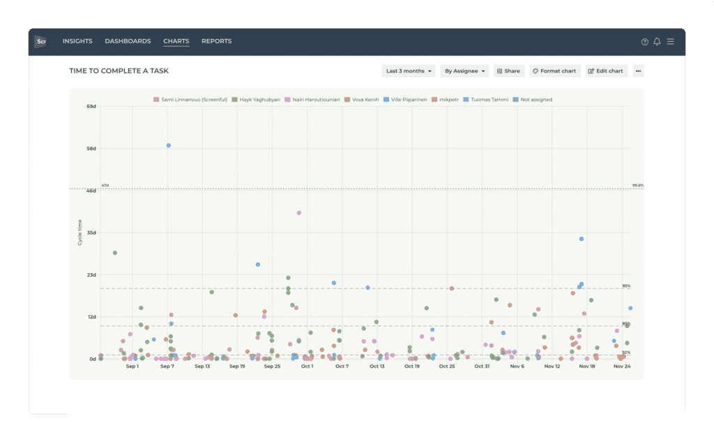
Track completion times of individual tasks
How long did it take to complete a task?
See the 50th, 75th, and 95th percentiles.
How long did an individual task spend on each workflow step?
Track the progress of the work during the lifetime of a project
How much is open vs completed out of the total scope?
What is the overall progress as a percentage?
Is the project progressing or stalled?

Bird's-eye view of your projects
Which tasks are close to the due date or overdue?
Does everyone have enough work assigned?
It’s a simple pivot table for your task data that allows you to track KPIs with configurable columns.
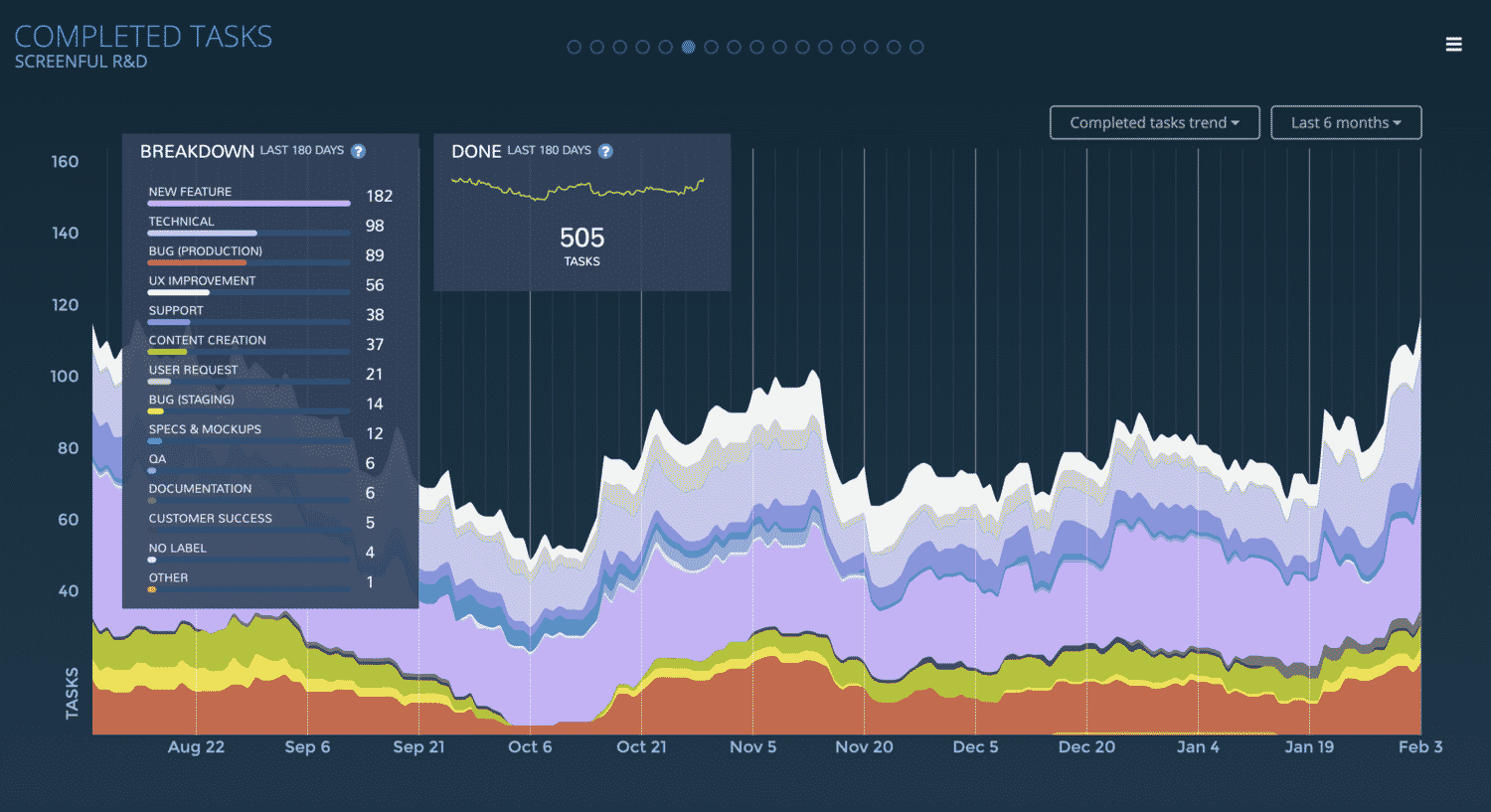
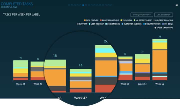
Track completed work
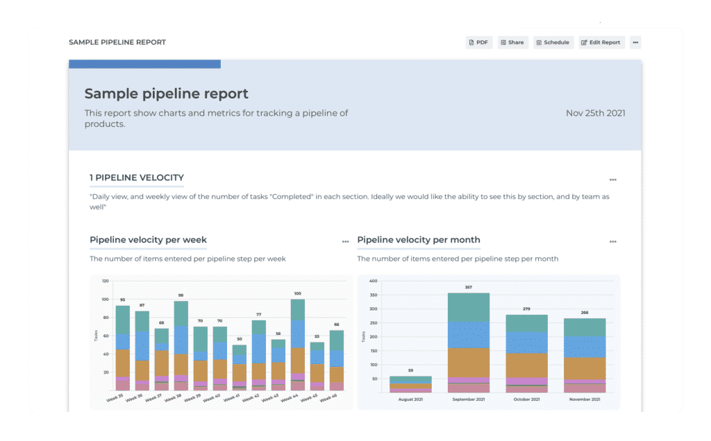
How much of the work was completed per week/month/quarter?
How is the works time spread out between different activities?
What is the trend — are we creating value or are we wasting valuable time?
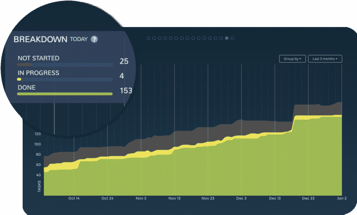
Track work in progress with the Cumulative Flow diagram
See trends and spot bottlenecks in your workflow.
See the total output over time.
Get an accurate picture of how stable your process is and how efficient your team is.
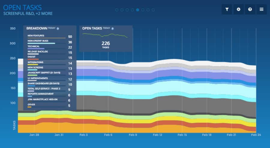
Track the backlog growth with the Open Tasks chart
How many open tasks there are per label/workflow state/assignee?
How much work is assigned to each individual?
Is unfinished work piling up?
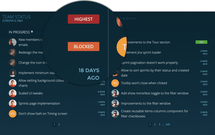
Team status in Screenful
See what each team member is currently working on and what has been completed recently. What’s in review? Is something blocked?
What's Currently In Progress?
The “In Progress list” shows the most recent tasks for which work has been started but not completed. Depending on your workflow, it may include such states as In development, In review, or In testing. Timestamps show how long the work has been in progress.
Which Tasks Are Overdue, Blocked, Or In High Priority?
Tasks that are in high priority, overdue, or blocked by some other task are shown with a status badge.
Timing screen
The Timing screen helps you to understand how long it takes to complete a task. Track your lead and cycle times, see how long tasks stay in a list, a board column, or a custom field. Find the bottlenecks in your process to pinpoint areas for improvement.
- Track lead and cycle times.
- See the overall trend of your lead time.
- See breakdown by the resolution time.
- See how long each workflow step takes.
- Click-through to see timings for individual tasks.
Milestone Burnup Chart
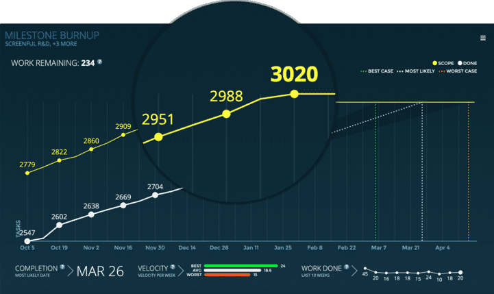
The Milestone Burnup chart allows you to track progress towards a milestone, such as completion of a customer project or a new product release. You’ll see how much work is done vs left, and you’ll also get forecasts based on your team’s past velocity.
- Track your project progress.
- Are you in danger of a scope creep?
- What are the different scenarios for completion?
- Get data-driven forecasts.
Progress Chart
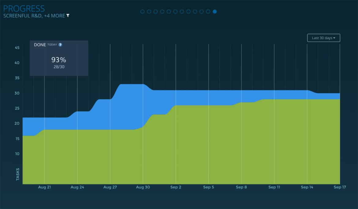
A progress chart shows the progress of work during the lifetime of your project. You can see the overall progress as a completion percentage. The colored areas correspond to the amount of work done vs amount of work not done at any given time.
- See the overall progress of a project.
- See the trend of completed work.
- Set the scope by adjusting the filter.
Task Status
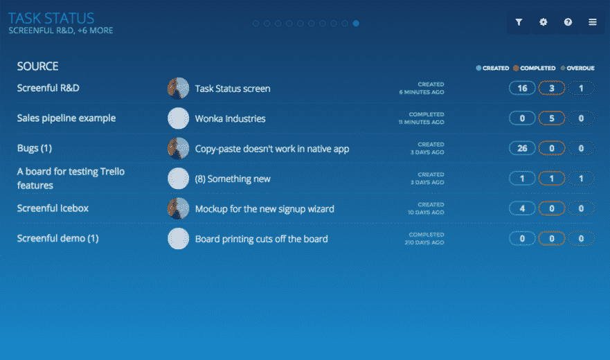
Task Status screen allows you to get better view on your open and completed tasks. It allows you to slice and dice your tasks in various ways and quickly find anomalies like the tasks that are blocked or overdue. In addition to seeing total counts, you can also click through to see the individual tasks.
- See the number of tasks in different states.
- Are there tasks that are delayed or overdue?
- Click through to see the individual tasks.
- Slice & dice your data to get insights.

Cumulative Flow Chart
Cumulative flow chart shows the amount of work in different stages of your workflow during the lifetime of your project. It allows teams to visualize their effort and project progress, and to see the if work is piling up or causing bottlenecks. It is an essential tool for assessing the health of a Kanban process.
- See the breakdown of tasks in different states.
- See the trend of completed work.
- Spot bottlenecks early to avoid delays.
Open Tasks Chart
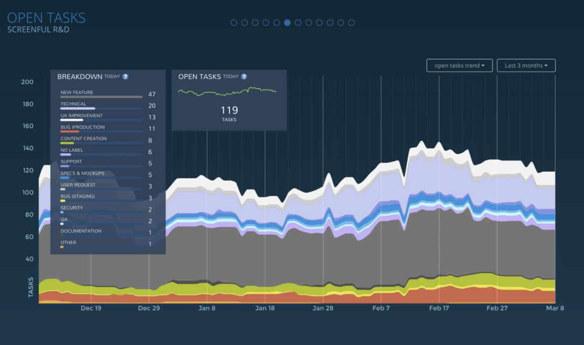
Open Tasks chart shows the amount of unfinished work in your project and how that changes as your work progresses. See how much work is assigned to each team member, or associated with a specific label. See how your backlog develops over time.
- See how many tasks are currently open.
- Is your work flowing smoothly or piling up?
- See the trend of open tasks.
- See the weekly, monthly, and quarterly breakdown.
- Slice & dice per board, label, and assignee.

